# Styles
# Override colors
You can easily override the default palette colors, opens in a new window by creating the .vuepress/styles/palette.styl file.
e.g.
$accentColor = #3ab982
$darkAccentColor = #3ab982
$sepiaAccentColor = #3ab982

// ...
TIP
The theme comes with light, dark and sepia color palettes.
If you don't want to make any of these themes available, just don't include them in the colorMode property
# Add theme color
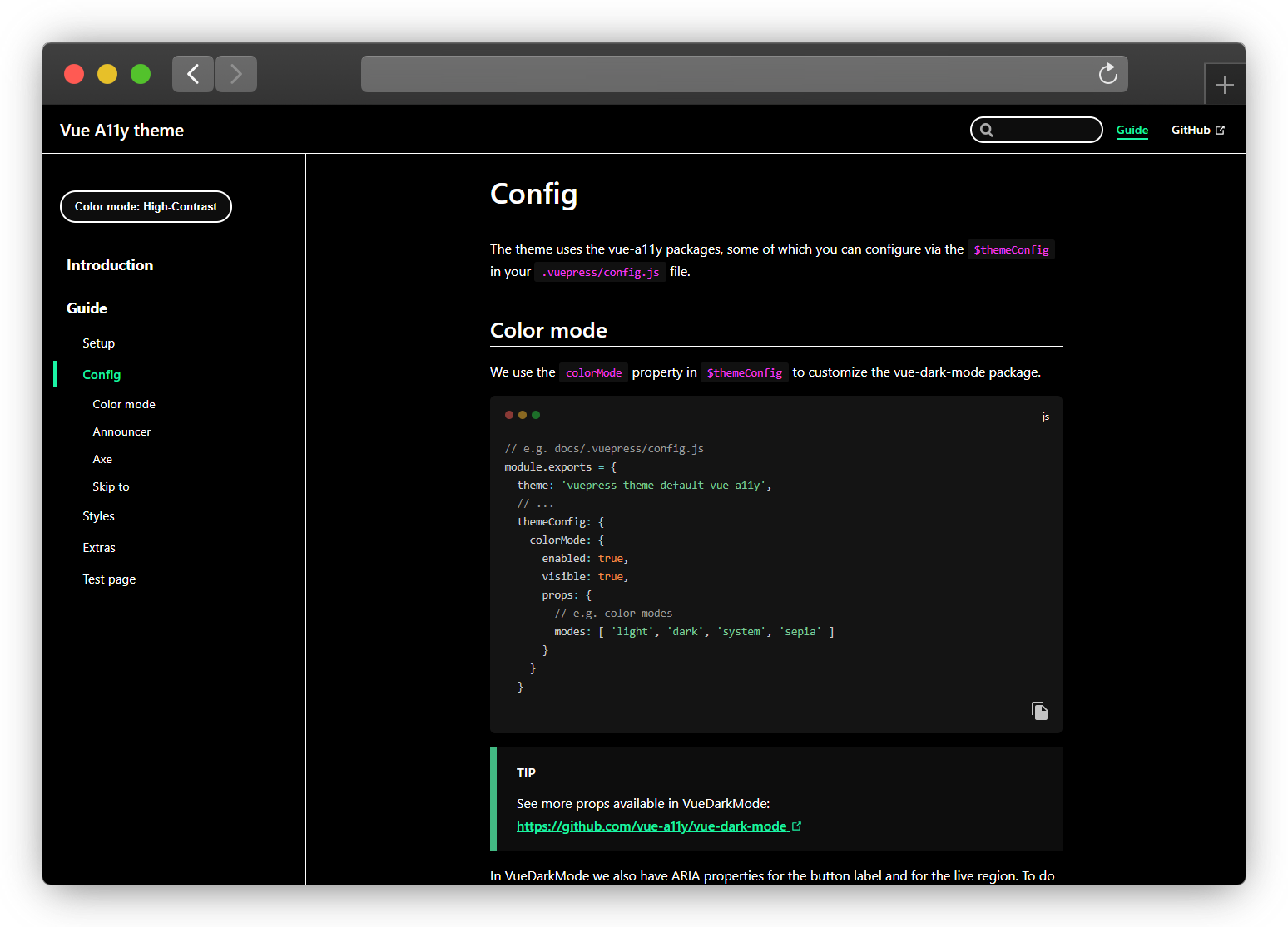
To create a new theme is simple, first you need to add this new theme in the props of the colorMode property in themeConfig.
// e.g. docs/.vuepress/config.js
module.exports = {
  themeConfig: {
    colorMode: {
      props: {
        modes: [ 'high-contrast' ]
      }
    }
  }
You now need to create the style files where you will create new variables.
// e.g. docs/.vuepress/styles/palette.styl
$highContrastBg = #000
$highContrastBgSecondary = lighten($highContrastBg, 8%)
$highContrastColor = #fff
$highContrastBgCode = #111
$highContrastBgSearch = $highContrastBgSecondary
$highContrastBgCodeBlock = $highContrastBgSecondary
$highContrastAccentColor = #1bf4a5
$highContrastTextColorLink = $highContrastAccentColor
$highContrastBorderColor = $highContrastColor
$highContrastTextColorCode = #f33bee
$highContrastOutlineColor = $highContrastColor
$highContrastBgTipDanger = #AD0000
$highContrastBgTipWarning = #fdff00
// e.g. docs/.vuepress/styles/index.styl
html.high-contrast-mode
  --bg: $highContrastBg
  --bg-secondary: $highContrastBgSecondary
  --bg-code: $highContrastBgCode
  --bg-search: $highContrastBgSearch
  --bg-code-block: $highContrastBgCodeBlock
  --color: $highContrastColor
  --accent-color: $highContrastAccentColor
  --text-color-link: $highContrastTextColorLink
  --border-color: $highContrastBorderColor
  --text-color-code: $highContrastTextColorCode
  --outline-color: $highContrastOutlineColor
  --bg-tip-danger: $highContrastBgTipDanger
  --bg-tip-warning: $highContrastBgTipWarning
TIP
You can consult the existing css variables in the theme through this link, opens in a new window
